
Choosing Interior Paint Colors and Sheens
The gray that looked neutral in the store can turn violet on a north wall. How light, undertones and reflectance change a color, which sheen belongs on which surface, and a sampling routine that avoids repainting.
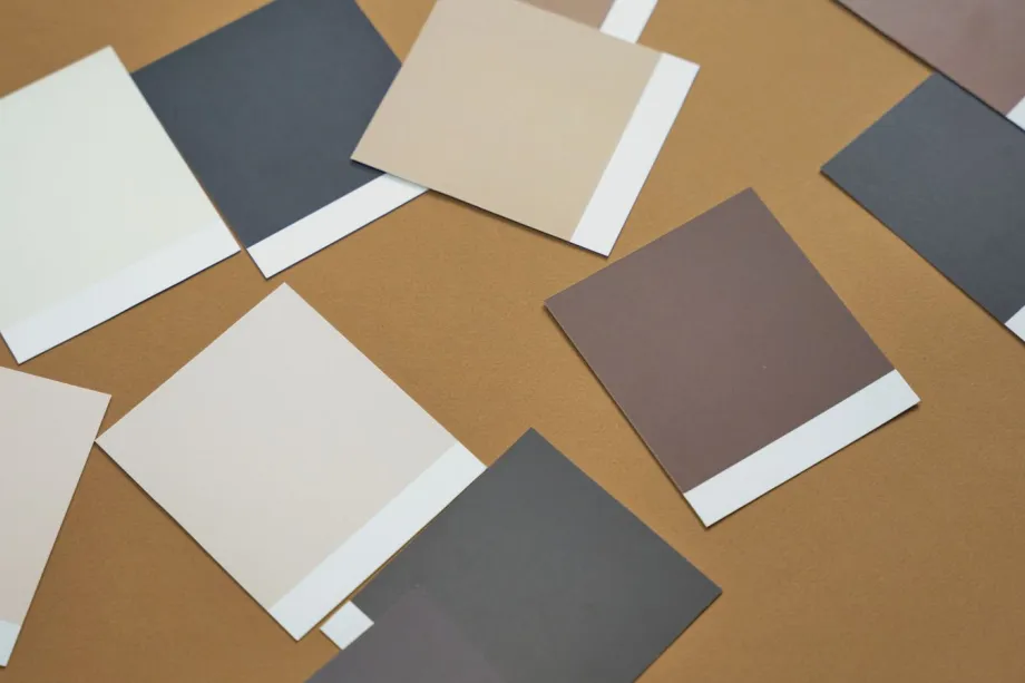
Testing colors in real light conditions
Lighting changes paint color continuously from morning to night. A gray paint sample that appears neutral under fluorescent store lights can look purple under warm incandescent bulbs or blue under cool afternoon light. Evaluating paint in the specific space where it will be applied prevents costly mistakes.
North-facing rooms receive indirect daylight with cool undertones. Colors in these spaces often look darker and cooler than expected. South-facing rooms receive bright, warm sunlight throughout most of the day, which intensifies light colors and can wash out pale neutrals. East-facing rooms get warm light in the morning and cooler light later in the day. West-facing rooms start cool in the morning and end the afternoon with intense orange-tinted daylight.
Never choose paint based on a small swatch held against an existing wall color. Old paint colors distort how your eye perceives a new shade. Paint test patches directly onto white poster boards instead of applying them directly to the wall. Move these sample boards to different walls throughout the day. Look at them in the morning, at midday and in the evening under your own lamps.
Understanding undertones and light reflectance value
Every paint color contains two distinct components: the mass tone and the undertone. The mass tone is the dominant color you notice immediately. The undertone is the subtle hue beneath it, created by the mixture of pigments. Neutral paints like white, gray, beige, and greige always lean toward specific undertones such as pink, yellow, green, violet, or blue.
To spot undertones quickly, place your chosen color swatch next to pure white paper and next to other shades from the same color family. A beige paint placed beside a true red swatch will reveal any green undertones quickly. Matching undertones across furniture, flooring, cabinetry, and wall paint prevents color conflicts between room elements.
Light Reflectance Value, often abbreviated as LRV, measures the percentage of light a paint color reflects. LRV runs on a numerical scale from 0 to 100. Black sits at the bottom of the scale and the brightest whites near the top. Most paint makers print the LRV on the chip or the product page.
High-LRV colors bounce more light around, which helps small or dim rooms. Low-LRV colors soak light up and make a room feel more enclosed, which works best where there is plenty of daylight to spare.
Matching sheen to room function and wall condition
Paint sheen affects both visual appearance and physical performance. Glossier paints reflect light and resist moisture, while flatter paints absorb light and conceal surface imperfections. Selecting the correct sheen requires evaluating room usage, moisture exposure, and wall smoothness.
Flat and matte paints
Flat paint has almost no shine, so it hides bumps, tape joints and patches better than anything else. This makes flat paint standard for ceilings and low-traffic areas. However, flat paint absorbs dirt and oils. Cleaning flat paint with a damp cloth can leave shiny spots known as burnishing.
Matte paint offers slightly more durability than flat paint while keeping a non-reflective look. It works well on adult bedroom walls and dining rooms where wall surfaces have minor irregularities but require occasional light wiping.
Eggshell and satin finishes
Eggshell paint reflects a low level of light, similar to the surface of an egg. It provides a reliable balance between hiding wall flaws and offering easy washability. Eggshell works well in living rooms, bedrooms, and home offices.
Satin paint has a slightly higher sheen than eggshell. It produces a soft luster that resists moisture and scuffs. Satin handles frequent wiping without wearing down, making it suitable for high-traffic hallways, kids' bedrooms, foyers, and family rooms. Because satin reflects more light, wall prep must be thorough to smooth out deep scratches or poor drywall repairs before painting.
Semi-gloss and high gloss finishes
Semi-gloss reflects a noticeable shine and creates a hard, durable surface. It repels water, grease, and stains, which makes it ideal for trim, baseboards, doors, window sills, kitchens, and bathrooms. Once cured, it shrugs off splashes and steam better than the flatter finishes.
High gloss provides a glass-like shine and maximum durability. It is common on exterior doors, cabinets, and architectural millwork. High gloss paints highlight every minor defect on a surface. Sanding, priming, and patching must be completed carefully before applying high gloss paint.
Washability and touch-ups
Higher sheen levels allow easier cleaning. Stains, fingerprints, and dirt wipe off semi-gloss and satin paints with mild soap and water without damaging the paint film. Flat and matte paints require gentle handling to prevent removing pigment or creating polished spots.
Touch-up work follows the opposite rule. Flat and matte paints blend smoothly when you dab fresh paint over a scuffed spot. Glossier paints show touch-up patches easily because the new paint reflects light at a different angle than the surrounding weathered coating. When repairing satin or semi-gloss walls, repainting the entire wall section from corner to corner yields the best result.
How sheen reflects light directly affects how wall defects appear. Shinier finishes accentuate dents, uneven drywall joint compound, and texture patches. Flatter finishes diffuse light, making surface flaws less noticeable.
Coordinating color palettes across connected spaces
Open floor plans demand careful color transitions. When sightlines extend from the entryway through the living room into the kitchen, wall colors should complement each other without clashing.
Using colors with similar undertones keeps connected spaces cohesive. A warm greige in the living room pairs smoothly with a warm off-white in the dining area. Choosing different shades from a single paint strip card maintains color harmony while creating visual depth between rooms.
Keep trim colors consistent throughout open areas. Using the same bright white semi-gloss paint on baseboards, doors, and trim across all adjoining rooms creates structural clarity and unifies different wall colors.
Step-by-step guide for testing paint samples
Before buying gallons, sample properly:
- Purchase two or three sample cans in slightly different shades or sheens.
- Paint two coats onto separate large white poster boards, leaving a white border around the edges.
- Label the back of each board with the color name, brand, and sheen level.
- Move the boards around the room, taping them to walls adjacent to windows, doors, and trim.
- Observe the samples under morning daylight, direct afternoon sun, warm lamp light, and LED fixtures.
- Place the sample boards directly next to flooring, countertops, cabinets, and upholstery to check for undertone conflicts.
Frequently asked questions
What is the best paint sheen for interior walls?
Eggshell and satin work best for most interior walls. Eggshell handles light wiping in bedrooms and living rooms while masking wall imperfections. Satin offers higher moisture and scuff resistance for hallways, entryways, and kids' rooms.
How does light reflectance value affect room appearance?
Light Reflectance Value measures how much light a paint color reflects on a scale from 0 to 100. Paint with a high value reflects natural and artificial light, making small rooms appear bright and spacious. Dark paints with low values absorb light, producing a cozy and enclosed atmosphere.
Which paint finish works best in kitchens and bathrooms?
Semi-gloss is the traditional choice because it sheds water and grease and stands up to scrubbing. Many paint makers also sell satin or eggshell paints formulated for kitchens and baths, which give a softer look with similar washability. Good ventilation matters more than the sheen.
Why do paint colors look different on the wall than on swatches?
Paint swatches are viewed under bright store lighting against white backgrounds. On room walls, natural light changes throughout the day, and artificial bulbs alter color warmth. Existing wall colors, flooring, and furniture also cast undertones that change how the color appears.